immutable.wedding Development Retrospective
October 09, 2021
Translated from the Korean original.
With my wedding coming up on October 23rd, 2021, I built a mobile wedding invitation for myself, and alongside it, a template called immutable.wedding. COVID-19 got worse and the wedding ended up canceled, but writing up how it came together is my way of dealing with the disappointment.
Our Process
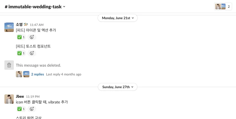
We tracked tasks the simplest way possible: post what needs doing as a message in our shared Slack, tack on a ✅ once it’s done.
Splitting Up Roles
It was a small project, but we had a tight timeline and needed to move fast, so we split roles clearly. (Side note: we’re both frontend developers by day.)
My partner took the PO role — design, scheduling, content planning — while I was the maker, weighing in on decisions and heads-down on development.
We stuck to our own lanes through the first half of the project, then crossed over into each other’s territory near the end to push it across the finish line together.
What We Weighed, What We Skipped
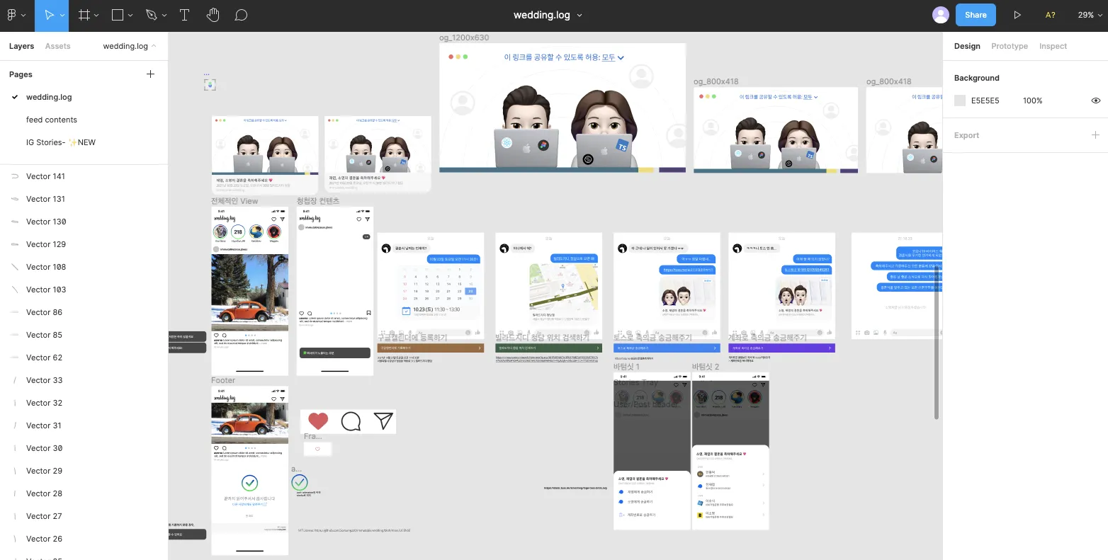
You can probably tell from the design board — the whole concept is Instagram.
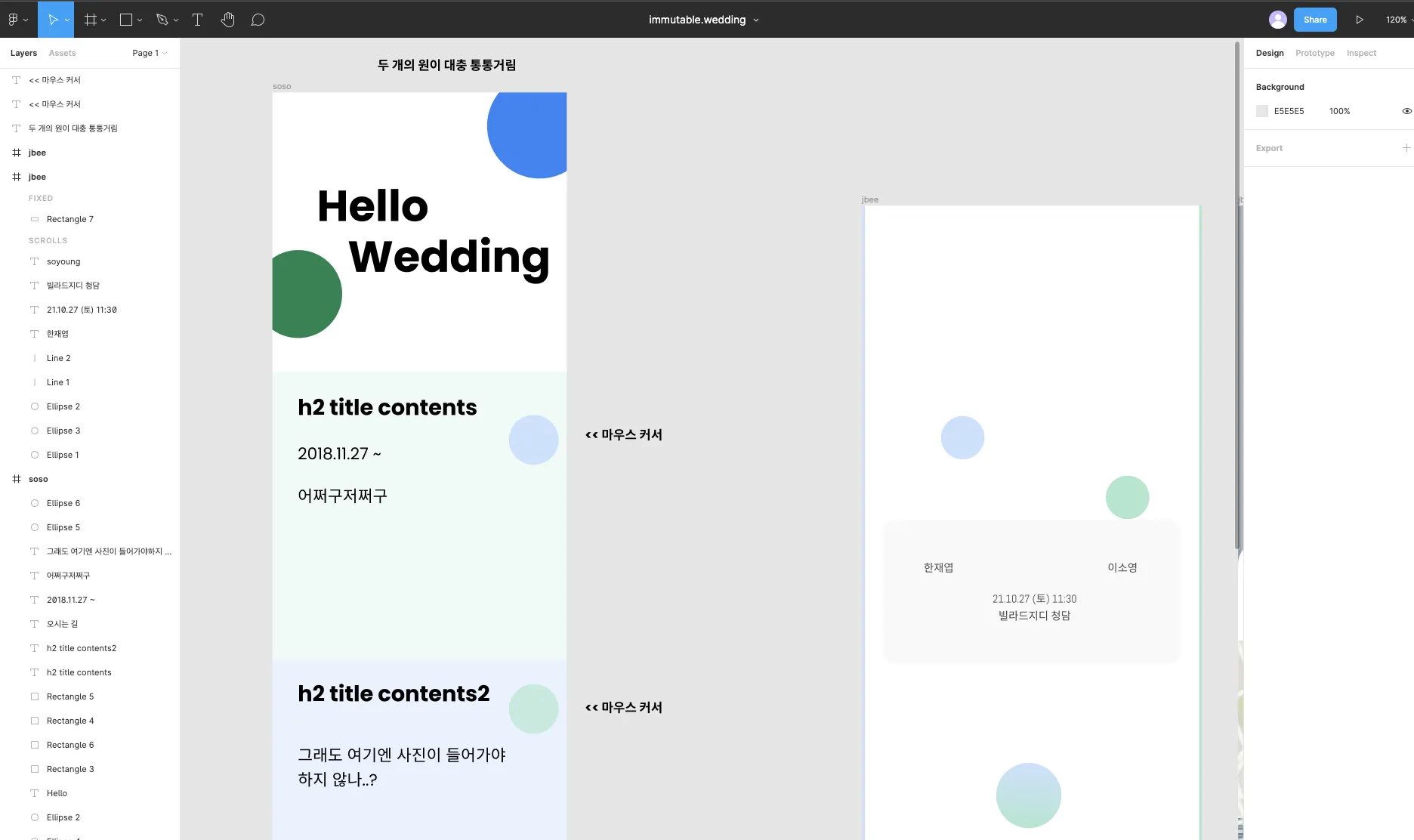
We tried designing from a blank page more than once, but no matter how much we sketched, nothing worth keeping came out. 🥲
We figured building a design from scratch in our tight window just wasn’t realistic, so we went with a template instead. After going back and forth on a concept that could “tell our story well,” we landed on borrowing Instagram’s design.
Still, being a side project, we used it to try things we’d always wanted to. We picked up some new tech within a range of unfamiliarity we could stomach, and pushed ourselves on animation in a bunch of different ways. (More on that below, in “How We Built It.”)
How We Built It
For CSS, we finally got to use framer-motion and stitches.js, two libraries I’d been eyeing for a while. We also built as much as we could ourselves, using several open-source design systems’ internals as reference. Just reaching for a solid open-source library would’ve worked fine too, but we picked this route on purpose, to learn from their structure and API design by reading the source.
We started with tailwindcss and twin.macro, but since I’d already used that combination on an earlier project, we migrated to stitches.js partway through. (See also: my post on tailwind + twin.macro + emotion.)
Things We Tried
useNotificationState, which drives the toast at the bottom of the screen, was built by referencing mantine’s notification library. While porting it over I ran into a few things I wasn’t thrilled with, though since I can’t even remember what they were by the time I’m writing this, they probably weren’t a big deal.
We also deliberately tried out some prop designs we don’t normally reach for, in components like Image and ListItem. Overall they felt convenient, but since this project never had to grow to absorb a wide range of requirements, I can’t really vouch for them with full confidence. 😅
The Animations
This one plays when you tap the heart button: it grows for a beat while sparkles pop up around it. It’s a short animation, but I think I spent close to a full day just on this.
Between the animation sequence, how far the sparkles should spread, and the timing, this ended up being the second most time-consuming part of the whole project. We used stitches.js everywhere else, but the fine-grained control this needed was hard to pull off there, so we fell back to sass for this one.
A circle draws itself, then a check mark draws in at the center. This took even longer than the heart animation — the icon that came with the Instagram design template wasn’t shaped right for what we wanted, so we went through a lot of trial and error, including drawing the icon ourselves from scratch.
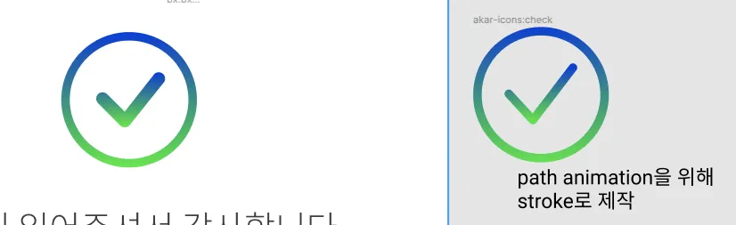
It wasn’t just the icon — I also wasn’t very comfortable with SVG animation itself at the time. This project is actually what pushed me to sit down afterward and study how SVG is put together and how it behaves, through docs and books.
This is the page-swipe animation: swipe horizontally and it transitions to the next page. Out of everything in the project, this ate up the most time. (And the bug is still there..)
I dug through a lot of the framer-motion API and examples trying to get the page-turning feel just right, but between mobile scroll behavior and position control, I couldn’t get it to a polished state. If I ever reuse this mobile invitation, this is the first thing I’m fixing. (PRs welcome too.. 🙌)
A Few Other Things
Because it was a “side project,” we deliberately wandered into unfamiliar territory and made things harder on ourselves on purpose, which let us try things we don’t usually get a shot at in our day jobs.
Working within a tight timeframe left some rough edges, both in the small UX details and the bigger picture, but like any project, I think it can get better bit by bit. (I’ll probably reopen it once COVID-19 is finally over 🥲)
You can check out a demo of this project here.
Closing
Thank you and all my love to Jbee, the other half of this project, who worked on design and content and even wrote code, and who is my partner for life and my best friend.
